Branding Case Study
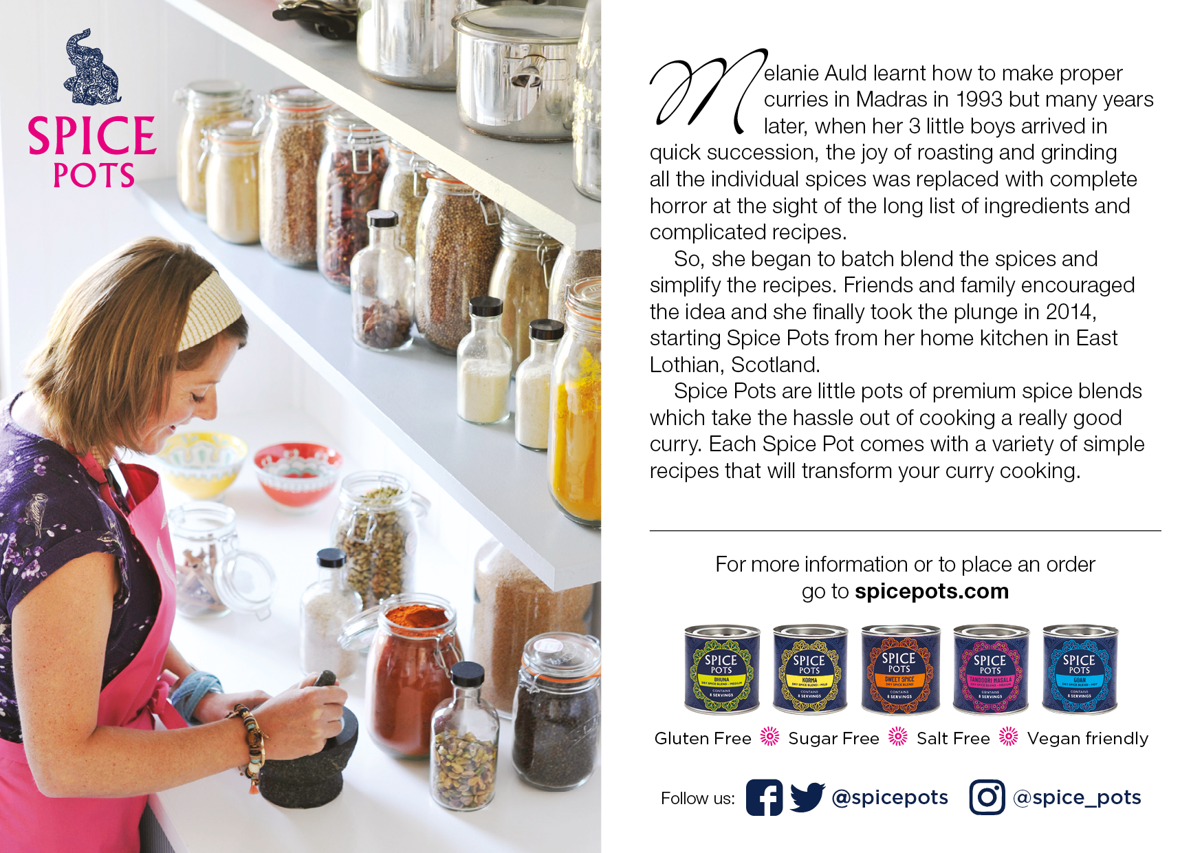
Spice Pots is a UK-based brand on a mission to enable people to create authentic Indian curries at home. Sold in beautifully designed, recyclable tins, these premium spice blends solve the problem of cooking quick, nutritious meals without slaving over a stove for hours.
The Challenge
The target audience consists of busy working parents and family members who want to eat well but lack the time for complicated recipes. The packaging needed to appeal to this demographic: friendly, vibrant and approachable, while still communicating the authenticity of the spices inside.
The Brief & Process
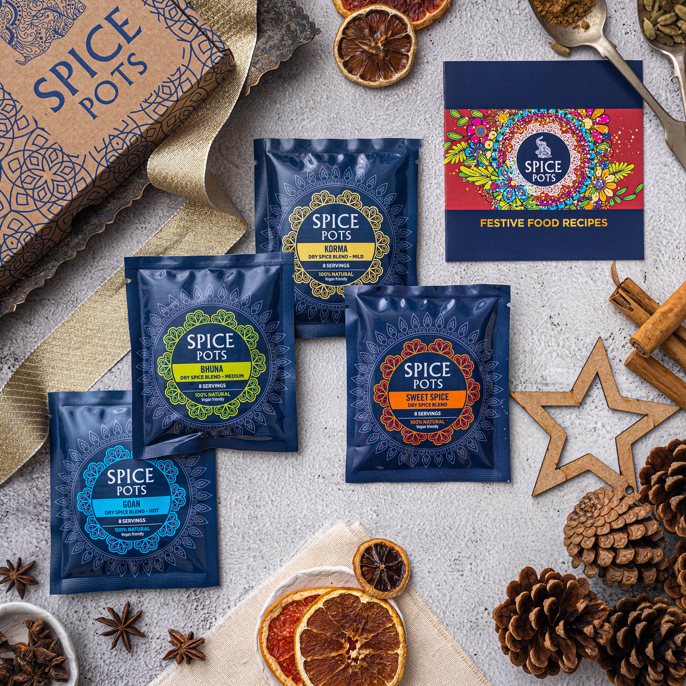
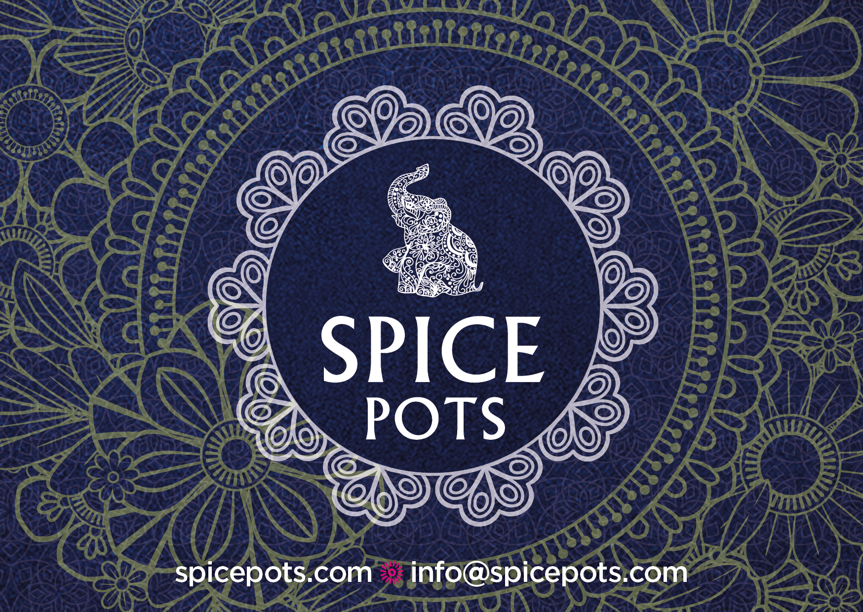
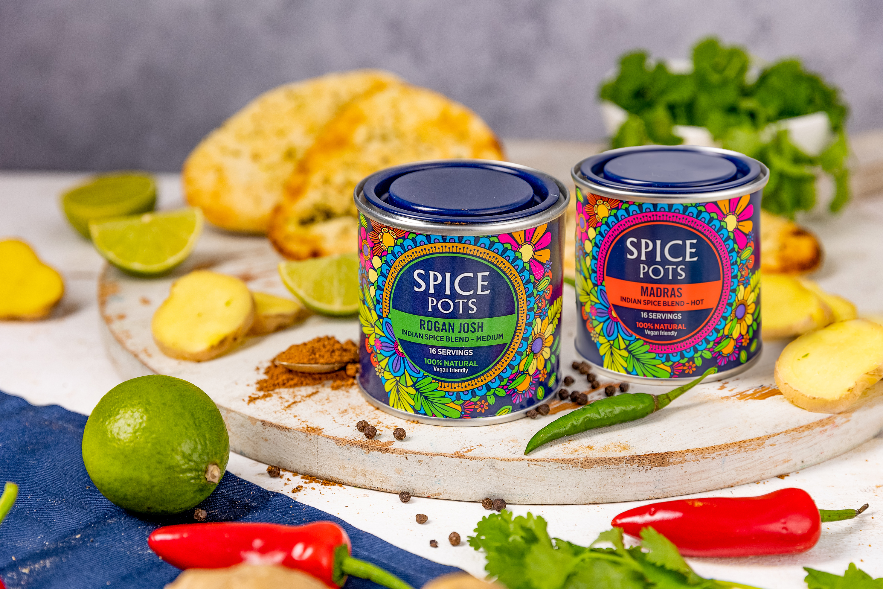
The client specifically requested an elephant device and an Indian feel incorporating vibrant colours and patterns. The foundation colours were set as dark navy blue and bright neon pink, creating a strong contrast.
For the patterns, we drew inspiration from traditional Indian Mandalas. We paired these intricate elements with a clean sans-serif typeface for the body text, ensuring it remained highly legible across both digital distribution channels and print packaging.
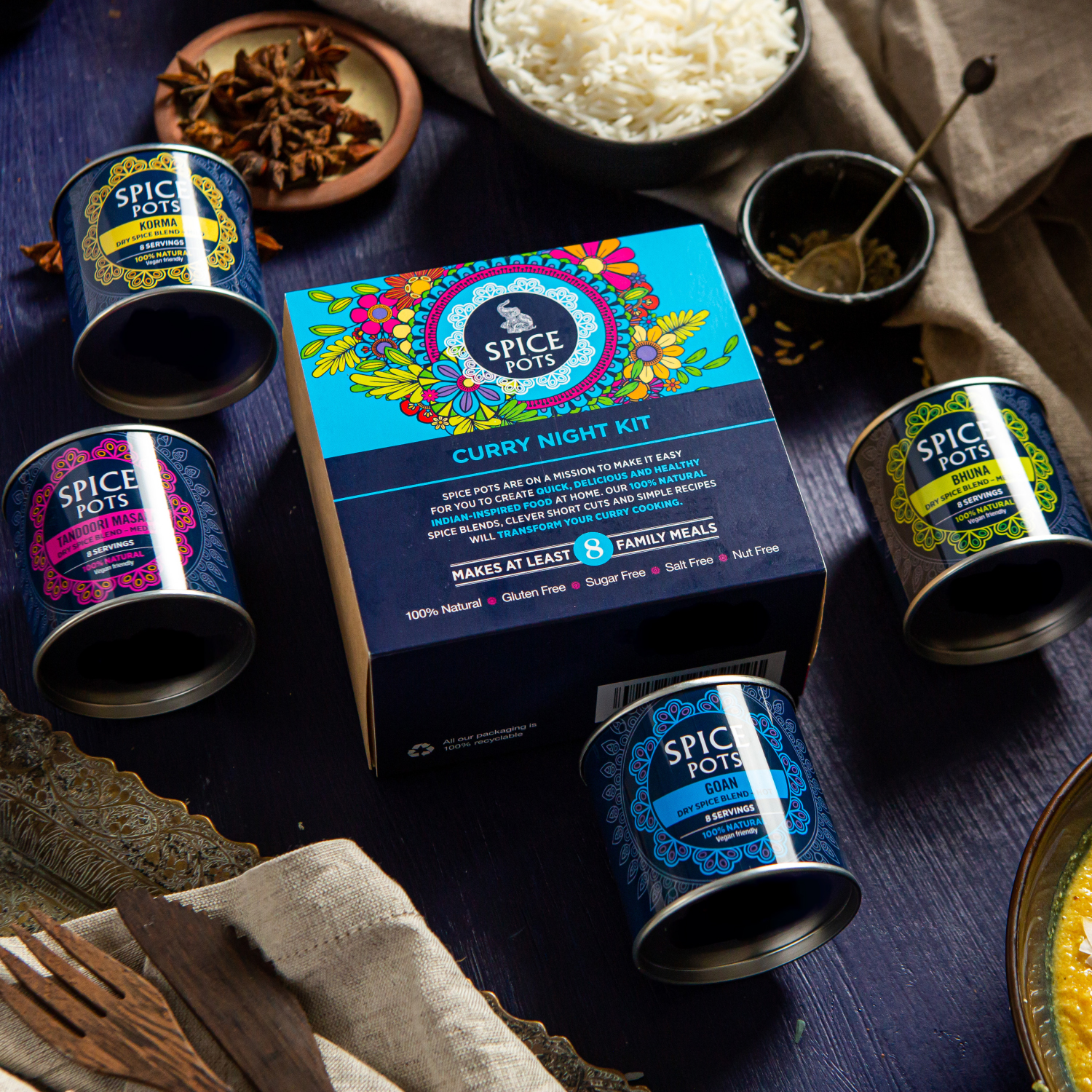
Vibrant Product System
To distinguish between the different blends, we assigned individual colours to each flavour. We strategically used "hot" colours for the spicier curries and "cooler" colours for the milder blends. This colour-coding helps customers quickly identify the heat level while maintaining a cohesive brand family on the shelf.
The Outcome
The product launch was a massive success. The striking, recyclable tins caught the eye of both consumers and retailers alike. The brand was quickly picked up by numerous local stores as well as top national retailers such as Asda and Amazon, establishing Spice Pots as a premium, go-to shortcut for home cooks across the UK.